BTW, That New and Allegedly Definitive Saez-Zucman Result IS A POWERPOINT SHOW
Phil Magness tipped me off to this with his innocent Facebook query, wherein he politely asked: Can anyone find an actual paper that explains how Saez-Zucman (2014) gets their results, which–we are assured by Piketty and by Krugman, plus a host of lesser fans–demonstrate quite definitively that Piketty gets the basic story right in his composite trend lines? Because all Phil could find was a PowerPoint presentation.
Well, I assumed Phil had to be mistaken, but I couldn’t find a paper either. Then Phil pointed me to this Twitter exchange:
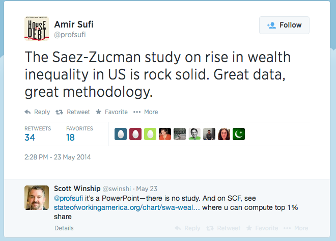
(Winship is an expert in this area, who has been quoted by Piketty’s fans to argue that Piketty didn’t do anything dishonest. So if he’s here saying that Saez-Zucman (2014) isn’t actually a paper yet, he probably knows what he’s talking about.)
So to repeat: One of the allegedly most devastating responses to Chris Giles’ FT critique, is to say that Saez-Zucman (2014) show that the very wealthiest Americans have surging wealth concentrations, not seen since the Gilded Age. Therefore, even if one thinks Piketty botched some Excel formulas, his basic story is right.
And what’s funny about this, is that “Saez-Zucman (2014)” isn’t a published paper, and it’s not even a working paper where you can see how they came up with their results. No, everybody is linking to a PowerPoint presentation. (It’s this one, right here.)
Anyway, here’s one of the bombshell charts from that PowerPoint show:
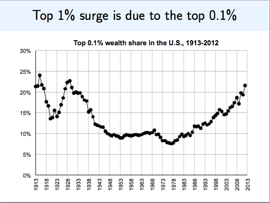
Yikes! Looks like Piketty was right to sound the alarm. Let’s tax the heck out of those rich people before it’s too late!
But wait a second. Before we enact a global tax on capital, on the basis of two guys’ PowerPoint slide, maybe we should compare their chart with the peer-reviewed literature. For example, when the same guy–Emmanuel Saez–and a different co-author wrote a paper in 2004 (which was eventually published in the National Tax Journal), here’s what they found, using estate tax data:
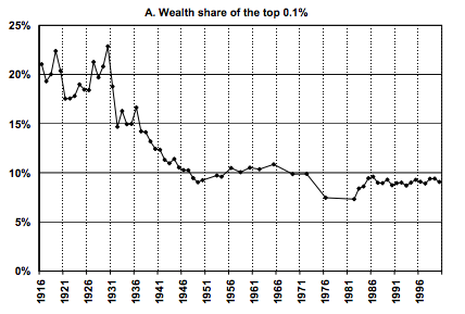
Interesting, huh? Compare Saez’s 2014 results with his 2004 results. From 1916 through the mid-1980s, they’re about the same, within a few percentage points of each other. It looks like they are both decent measurements of the same thing.
Yet with the estate tax data, nothing happens from the 1980s onward. In particular, from the mid-1970s through the year 2000, the share held by the 0.1% goes from about 7% to about 9%, maybe an increase of 30% or so, tops (I’m just eyeballing the bottom chart–you can look at the exact figures in the NBER link if you want).
In contrast, looking at the middle chart above, we see that from the low point in the mid-1970s through the year 2000, the wealth held by the 0.1% richest Americans went from about 7% to about 15%–i.e. it more than doubled. And of course, after that it continued to take off like a rocket. (Here of course I have to just eyeball the chart–because we’re relying on two guys’ PowerPoint show.)
Now it’s true, Saez and Zucman in their PowerPoint do discuss Saez and co-author’s (2004) results using estate tax data, and why they think their current approach is superior. Yet the arguments they give (on a PowerPoint bullet list, keep in mind) don’t really explain why the estate tax approach worked beautifully up through the mid-1980s, after which it horribly began understating wealth.
Finally, you might say, “OK Murphy, do you have any explanation for why Saez and Zucman (2014) might be screwing things up?”
Actually, I have a guess. They are relying on a capitalization method, where they take reported capital income and then divide by the return on capital in order to compute an estimated value of the asset. Because interest rates, especially short-term rates, have dropped so much since the 1980s, it wouldn’t surprise me at all if something screwy is happening whereby Saez and Zucman are generating an inflated asset value based on short-rates that people in the market don’t think will last for the next several decades.
But to repeat, this is just a guess. I can’t really say what may have gone wrong with the Saez-Zucman (2014) results, because WE ARE TALKING ABOUT A )(#*%(#$ POWERPOINT SHOW.


I am getting my popcorn ready!
It gets more embarrassing everyday for the Piketty supporters.
Even if it is true, look at the chart and tell me what that should prove. First it falls, then it stays flat, then it rises. How would you draw any conclusion from it?
The chart itself doesn’t tell you anything at all about the cause(s) behind this.
Rather than tax the wealthy, let us end all subsidy and regulation that makes the wealthy even more wealthy. Let us end all tax policy that punishes non wealthy, yet energetic and productive workers and entrepreneur. Let us cease inflation. The target should be 0% rather than 2%. When we get to 0%, let us discuss abolishing Fed and fiat.
Create a fair and level playing field( stop creating a rigged system) and then see where the wealth lands…
No no no no Murphy.
Sufi has assured us that it is ROCK SOLID.
Checkmate.
This reminds me if that hockey stick “hide the decline” data fudging from that climatooligist.
Look at Krugman’s latest,
Well, it didn’t seem so obvious Saez in 2004 (granted that graph only deals with wealth share of .1%, not inequality per sé).
Another thing, I wonder if some of these economists have passed the manuscript (if there is one) around between each other — i.e. if they’ve seen the paper before the rest of us will.
Look at Krugman’s latest column at Pravda On The Hudson (May 29th). There’s much to say about it but all pales when a Nobel economist employs the Broken Window fallacy to sell his politics and passions. If misunderstood the Great One, if I am mistaken, silly or just plain stupid and wrong please tell me, I can take it.
So writes the Great PK
“Third, the U.S. economy is still depressed — and in a depressed economy many of the supposed costs of compliance with energy regulations aren’t costs at all. In particular, building new, low-emission power plants would employ both workers and capital that would otherwise be sitting idle, and would, if anything, give the U.S. economy a boost.”
Piketty assumes Capital breeds and multiplies itself by some miraculous manner, Krugman assumes it sits idle, crossing it’s legs while having a cigar and cognac . I sometimes feel I’m living in an alternate universe.
Anything and everything these people say is, for me, wrong until proven otherwise beyond reasonable doubt.
Bob, the working paper has been distributed at talks, in a very preliminary version. And when you say “just a PowerPoint,” you’re making an implicit statement about the rigor out into it that you can’t possibly believe, but I suppose your sycophants do.