More Charting Fun With Krugman–Job Creation Edition
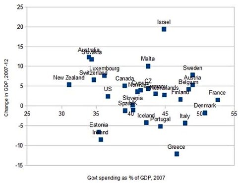
What I mean by the title, is that I have a menial task for some plucky Free Advice fan. In this post from May 3, Krugman was arguing that there was no correlation between the size of government pre-crisis and how it did during/after the crisis. He posted this chart:
In reference to the above, he wrote, “So what is the correlation between the size of government and recent economic performance? None at all, as far as I can see.”
Now when I eyeball that chart, it seems that there is definitely a negative correlation. That doesn’t mean causation, of course, but my point is that Krugman isn’t able to “see” anything there, when I think I can see a pattern.
What struck me as funny about this is that very often Krugman will put up scatter plots that bolster his case (in his mind), even though there are a lot of outliers in those ones too. Because I don’t subscribe to the NYT, and also because I was busy, I didn’t bother going back and looking them up, but I remember Daniel Kuehn called Krugman out on one of them within the last few months.
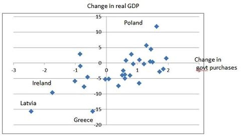
Anyway, on May 21 Krugman put up a scatter plot that he thought showed how obvious the case for stimulus was:
So here are my requests:
(1) Can someone grab the data Krugman used to generate the above charts, and then plot the OLS regression line and give us the stats (like the R^2 value I guess)? I’ll PayPal you $15 if you do it right and I agree you accurately reproduced Krugman’s charts. (It will have to be the first person who emails it to me. If you do the work and someone beats you to the punch, that’s not my fault. So maybe you should coordinate in the comments.)
(2) Now I confess, I think the second chart looks like a way better correlation too. I’m just saying, Krugman is denying that the first one has any pattern, when I think I see one. But, I wonder if Krugman has ever posted another scatter plot in the past, where he also drew the line in himself to help the readers “see” it, that has a worse fit than the first plot above. If you can show me that, I’ll PayPal you $40. (If it’s really close, like you find him touting a chart that has only a slightly better fit than the one he says has no pattern at all, then I’ll probably give it to you.)
I remain final arbiter in all disputes over payment. I am the decider. But please talk to each other; this happened before when I wanted students at a school to dig up Paul Samuelson’s referee reports on my articles, and two guys did it simultaneously and I had to tell one of them I already paid somebody else. So be careful out there, kids.





On (1), I’ll add $20 to Bob’s $15. I’m old-fashioned: I don’t use PayPal. Bob is the final arbiter and once he chooses someone to get his $15, Bob can pay the person $35 and I will send the $20 check to Bob by snail mail within 24 hours.
Here’s my initial take on the data: The first link is an Excel file, and not knowing what charting you use I also included a link to a csv file for import into whatever program.
http://dl.dropbox.com/u/5979074/FreeAdvice.xlsx
http://dl.dropbox.com/u/5979074/FreeAdvice.csv
Oh, I should add I just did a linear trendline in excel. Does excel do an OLS regression or something different?
Either way, linear equation given was -.1824x + .1028
the R^2 value was .0241
Right just the linear trendline is what I mean.
This looks cool, John. But did you dig up the data from somewhere, or just eyeball Krugman’s chart and try to reproduce it?
I gave a quick search online but didn’t find an obvious dataset so I just overlayed the graph on an excel graph and reproduced the dataset. Each datapoint should be within 0.5%. The spreadsheet itself has Krugman’s chart so feel free to drag that on top of the reproduced chart.
If you need the actual dataset, and not just an approximate reproduction; a googling someone will have to go.
Here is a picture of the overlay: http://dl.dropbox.com/u/5979074/FreeAdvice.JPG If you redownload the excel file linked above they should be overlayed. If this is use-able and unless someone find the actual dataset (at which point my reproduction would understandably be dumped) then I can adjust the data to make it more accurate if necessary.
OK it looks pretty close. Would you mind doing the same for the second chart?
Done. The original link should work, but here it is again: http://dl.dropbox.com/u/5979074/FreeAdvice.xlsx
Here is a link for an overlay picture of the original graph and the reproduction showing it’s accuracy.
http://dl.dropbox.com/u/5979074/FreeAdvice2.JPG
All right thanks. Looks like Krugman wins this round. I’ll email you about the $35 ($15 from me and $20 from David).
A couple questions on the linear trend in excel – I’m almost positive it’s a simple linear regression line. Of course you’d need to run it to get the slope and R-squared.
Ya – as you note Bob I’m generally not a fan of these scatter plots. The second is probably more meaningful than the first because it’s going to difference out a lot of country-specific idiosyncrasies (you can see that simply in how much tighter the data is), but it’s still not a good way to get a multiplier – it will still be biased.
An R^2 of 0.024 means there is no correlation.
Typically, in the social sciences, an R^2 that is less than 0.20 is considered as showing no correlation between the variables. Usually 0.30 is acceptable at minimum.
In physics and chemistry, where causality is easier to nail down, the cut off is usually 0.60.
The graph of real GDP is stupid. GDP calculations count government spending dollar for dollar, so obviously when a component of GDP increases, so will GDP (assuming no endogeneity, which is ludicrous of course, but it’s not important for this point.)
Real GDP going up while government spending goes up means they count missiles and bullets, which are goods that questionably increase the standard of living of civilians.
re: “The graph of real GDP is stupid. GDP calculations count government spending dollar for dollar, so obviously when a component of GDP increases, so will GDP”
FANTASTIC! Major Freedom rejects the proposition of complete crowding out. There’s hope for you yet!
Two things, DK:
1. Read what I wrote in the parentheses.
2. I do not reject complete crowding out, I just view crowding out differently than what you are probably be thinking. I hold there is 100% crowding out in terms of scarce resource utilization. Scarce resources used up in accordance with governmentally driven ends, ipso facto are resources that cannot be used up in accordance with market driven ends. It’s the same scarce resource limitation, alternative ends framework that individual entrepreneurs face in the market, only instead of one entrepreneur making it impossible for everyone else to use up a scarce resource, it’s the government making it impossible for everyone else to use up scarce resources.
Therefore, when I talk about one component of GDP going up that makes GDP go up, I meant total money spending being the initial source of spending. I meant that a round of inflation financed government spending that makes G go up by itself, while not requiring any of the other components to go down, all in nominal terms, will make GDP go up. It’s like someone printing their own money, and then buying a computer. C will go up, no other component necessarily goes down, and so GDP will go up. Except in the government’s case, they buy things like missiles and bullets.
So just like the scarce resources I use up in buying the PC is 100% crowding out everyone else from that resource, despite GDP going up, so too are the scarce resources the government is buying is 100% crowding out everyone else, despite GDP going up also.
Unfortunately, too many people when they think about crowding out, are thinking about dollar flows only. One dollar flow one person spends/invests is supposed to be the focal point for whether or not others will spend/invest an equivalent sum of money. The question most people ask is “If the government spends $100, does that mean they are reducing everyone else’s ability to spend by $100, such that total spending, GDP, stays the same? Or can they add to total spending?” Or, “When the government borrows $100, does that mean that they are reducing everyone else’s ability to borrow by $100, such that borrowing for market driven purposes only declines by $100, which makes interest rates go up on private debt?”
I think these are the wrong questions to ask, because not only does it ignore what I consider to be the actual source of “conflict” and/or “competition” where “crowding out” really matters, namely scarce resources, but these questions also do not seem to grasp the crucial fact that the government can print its own money, and that “crowding out” can only really take place when total money flows in each context are fixed. Like total borrowing in nominal terms remains fixed. Total spending in nominal terms remains fixed. And so on. Only here would it be possible for one person’s “spending” or “borrowing” to crowd out other people’s spending and borrowing. Of course in the real world the government can print its own money, so all bets of nominal spending and borrowing crowding out are off. But as mentioned, and this cannot be stressed enough, there will ALWAYS be scarce resource crowding out. The government can print its own money out of thin air, but they can’t create cars and houses out of thin air, no matter how many paper dollars they print.
So I’m very sorry to say, DK, but I did not say what you think I said. So you can rest assured that there is still “no hope” for me, haha.
IMHO, the outliers are the interesting ones. The attitude of your typical Israeli citizen is strikingly different to the attitude of your typical Greek. Also, government spending does not in itself determine the size of government.
Also, Australia looks like it did a lot better than New Zealand on that chart, but also the Australian government borrowed a lot more money in recent years. Try plotting change in GDP less the change in gross government debt over the same years. Seriously, it’s long past time when we accepted debt-fuelled growth as real.
Murphy, this can be fodder for the next Krugman Kontradiction blog post:
http://krugman.blogs.nytimes.com/2012/05/27/the-jersey-comeback/?smid=tw-NytimesKrugman&seid=auto
Look at Krugman using indexes to compare relative job losses/gains between states, when he’s trying to nail Chris Christie the evil Conservative.
But way back when he addressed ABCT, he used absolute job gain/loss numbers to prove ABCT is wrong!
Bob,
I often play with data after I look at Krugman’s posts. Here’s a chart I put together that might be important when considering the second chart, which seems to have a positive correlation. I used the G20 plus Spain, Ireland, and Switzerland. Here is the excel file:
http://dl.dropbox.com/u/29668180/debtfigures-new.xlsx
When, instead of using change in gov’t purchases, you use public debt as % GDP and compare it to annual GDP growth, a negative correlation appears. Now, here a good argument could be made as to which causes which, if either causes either. But the correlation demonstrates that if you’re not massively in debt, you are more likely to have good GDP growth.
Thanks,
Bill Karr
One last note: it could be said by Keynesians that going in debt is the appropriate response to lacking GDP growth. However, this public debt in most of these countries has been accumulated over time.
In fact, this has been looked at. A better thing to consider is average public debt over the last [insert relevant number] of years and compare it to current annual GDP growth: http://www.americanthinker.com/blog/2010/03/graph_of_the_day_for_march_6_2.html
It seems to suggest that a certain bad Karma comes with holding long term public debt.
Sorry. One more important comment on that second chart.
The chart is NOT inconsistent with Austrian theory. Most people admit that gov’t spending cuts will have immediate negative affects on growth and employment. The argument between the Austrians and Keynesians is whether or not such negative effects in growth will be sustained. In other words, current cuts lead to the beginning of the recovery, which is the slump with the misplaced capital and assets are moving from bad sectors to good sectors.
Keynesians believe that spending cuts during recessions will lead to sustained negative growth. Austrians believe that it will lead to long term growth, but temporary slumps. Keynesians believe increased spending will lead to temporary growth and will not have long-term affects on growth. Austrians believe increased spending will lead to temporary growth, but long-term slumps.
There’s a chart on this blog post of mine plotting freedom against happiness. It’s not directly what you asked for, but it may help bolster your case, depending on which direction your article takes:
http://www.stationarywaves.com/2012/04/myth-of-socialist-paradise.html
I can supply the underlying data if needed – it’s just the economic freedom rankings versus the “gross domestic happiness” rankings.