Fun With Temperature Graphs!
I don’t know who generated it first, but Paul Krugman and Brad DeLong (see the top middle of his website) love this chart:
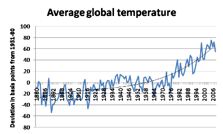
Yikes! That’s almost as scary as the monetary base.
But on second thought, notice the axis: deviations in basis points from an average.
I’ll rely on the same GISS data (though I’m using the Dec-Nov averages–which I believe real climate scientists prefer–whereas I’m pretty sure Krugman is using Jan-Dec averages) and plot the absolute temperatures:
(Degrees Celsius)

And if you used the only objective scale we have–the Kelvin–the warming would look even less worrisome.
I AM NOT saying that I’ve just blown up the case for limiting greenhouse gas emissions. What I am saying is that Krugman’s chart does a lot of persuasion with its presentation. Another big thing it does (perhaps unintentionally) is obscure the warming of the 1930s, because Krugman kept the x-axis labels at 0 rather than moving them down. So you really can’t “see” anything until the big breakout after 1976.