Illustrating “the Collapse” in Government Spending
[UPDATE below.]
Frequent commentator MajorFreedom linked to this, and I thought it worth highlighting. Remember, I had linked to David R. Henderson’s critique of Paul Krugman, who put up a graph–in a post titled “Unprecedented Austerity”–showing percentage changes in (a three-year average of) total government spending at all levels in the U.S. Krugman then said of this graph: “You can see that there was a brief, modest spurt in spending associated with the Obama stimulus–but it has long since been outweighed and swamped by a collapse in spending without precedent in the past half century.”
Because it was a graph of percentage changes, and because it had surged at first due to the stimulus, Henderson pointed out that it was very misleading. The particular figure Krugman used didn’t even fall below the 0% line until the very end of the series.
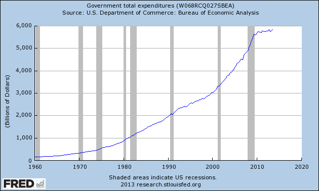
Anyway, here’s the absolute level of “total government expenditures”:
As Krugman might say: Feel the collapse!
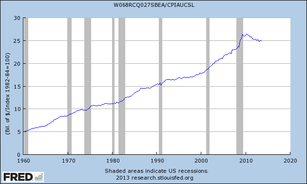
UPDATE: Krugman adjusted for price inflation. I’m not using his exact measure (I’m using CPI because that’s easier for me to grab from FRED) but here’s the above chart, dividing by CPI:
So yes, you do see an actual fall. Is it a “collapse”? It looks a lot less so in this graph than in the one Krugman posted. (Again, the reason–as David pointed out–is that Krugman chose to graph percentage changes, so the stimulus surge followed by an actual reduction [in inflation-adjusted numbers] made it look like a huge swing in his graph.)





Looks like a collapse to me.
http://research.stlouisfed.org/fredgraph.png?g=q0T
Water rushes into a tank. It sloshes up against a wall and sloshes back. You are counting the slosh back as a collapse. See why that’s not quite right?
Lets say spending continued on trend without the stimulus and it peaked at $3,040 in 2011. That would still be a big fall. Spending is currently at the level of 2007 before the recession
Still 100 times too much.
Why did you start the trend so late? If you take the whole data set:
http://research.stlouisfed.org/fredgraph.png?g=q0X
Looks to me that the long term trend in growth in government has seen no “collapse.”
Sure, if you start right before the crisis, as you did, then you can make any local reduction, which is still an increase over the long run, look like the biggest collapse ever.
DJ, where are you getting that? Spending is higher than pre-recession levels in inflation adjusted dollars, as seen in graph #2.
Yeah? My god, the real expenditures are back to (approximately) 2008 levels! COLLAPSE!!!!!!!!!!!!!!
Austerity can mean an increase or decrease in spending.
Heavens! A fall by 50 perc… oh, another poorly chosen axis.
The axis values range from 2760 to 3120. Look at from 0, and you’ll see basically no collapse.
To accept the premise that government must spend more every year is to accept the premise that government becomes less efficient each year…
While I think government is in general less efficient than weather carving presidents out of Mount Rushmore, what you said isn’t necessarily the case. For you have to take into account inflation of the money supply.
If any institution spent the same every year in an environment of inflation, then over time it would end up having control over fewer and fewer resources.
Yes but we are talking about a government that spends more every year , not the same. Baseline budgeting for starters.
Whatever amount they spend, 99% is most likely wasted. Want proof?
http://news.yahoo.com/john-beale-swindled-epa-1-110000069.html
“Yes but we are talking about a government that spends more every year ”
Yes, but if the reason for that is simply inflation of the money supply, which raises incomes and taxes, then the rise in spending is not a signal the government is becoming less efficient. It could very well be at the same inafficiency.
What would it look like if you took the $328 billion they spent during FY ’13, but counted as “off budget” until after the debt ceiling?
Look, Murphy came here trying to make the point that Krugman’s percent change graph was misleading by posting a levels version of the graph. Murphy not realizing that adjusting for inflation is important, posted his own misleading graph. Then not knowing how to find graphs on Fred, posted another wrong graph. I posted the correct one, and it looks like an even bigger collapse that the one Krugman posted.
If you wan to argue that including the stimulus is misleading, fine. If you want to argue that government spending will be too much until it reaches 0, fine. But the fact is that a government spending graph looks like collapse whether it’s levels or percent change.
Okay, I now see Krugman is talking in context of the entire history of the US. Then fair enough to Henderson’s point.
Actually, now I realize Krugman is talking post WW2. Point still stands!
Actually, it looks like you’re shooting from the hip all over the place and not thinking about this long enough.
DJ,
Then not knowing how to find graphs on Fred, posted another wrong graph. I posted the correct one, and it looks like an even bigger collapse that the one Krugman posted.
DJ, I’m using the very data Krugman used. That was one of David’s points in the original post on this–that Krugman is oddly using total government spending instead of the figure you cite.
Wait a second, I’m re-reading your comment… Were you AWARE that you’re using a different concept from the one Krugman was using, and you’re still chastising me for picking the “wrong” one?
I haven’t read everything regarding this particular discussion, but just looking at it at a gloss, it would appear to me that there is a lot of question begging going on with regard to “spending”.
As others have noted above, I don’t see much of a collapse. In fact if I eyeball the second graph, the level of real government expenditure is there where you’d expect it to be were you to draw a straight line from almost any point on the line to the present. There is hardly any deviation from trend. The sole deviation is the increase during the recession and perhaps the expenditure during the Bush years preceding the recession.
If you believe that sudden increases in (real) government expenditure are destructive for the economy, then the delay in the recovery is arguably the consequence of this massive increase in government expenditure.
And how do you define “collapse”? Must government spending fall back to the point it was at in 1960 or 1980?
For any reasonable person looking at the graph of real government spending, it has quite clearly fallen.
All Krugman needed to say is that real government spending has fallen in a way that — because of the multiplier — has prevented greater expansionary effects from government spending on the US economy.
If i climb up 5 flights of stairs and then walk down 1, my elevation has not collapsed.
Compare this to MF’s credibility, which has sunk to zero, but that is not a collapse either.
If you were on standing on a 500 meter tall building, and fell 100 meters , the hell you going to tell me your elevation hasn’t collapsed while shitting your pants.
If you were originally standing on the ground, and you went from 500 meters to 400 meters, you’d still be high in the air. The hell you talking about collapsing and shit.
The employment rate in the US fell from from 95% to 90%. It’s was still high. There was no employment collapse. Hurrah!
And the “only” conclusion you consider is that government spending is too low, not too big?
Per the above analogies…..
You can’t climb 5 stairs, fall back one, and call that a collapse or really even a decrease.
07′ outlays were 2.7 T, and 2014 = 3.7 T.
As the smart people are pointing out, you are still climbing the stairs, and goverbment’s share of the economy is larger than it was under Bushy(still too high)
Now you’re getting it. It’s all a matter of baseline perspective.
Oh, I know! And because the economy hasn’t recovered, that logically means that the spending level must have been too low, and therefore (by the Sumner/Krugman logic) it must count as a collapse, as “tight” policy!
Silas gets it!
LK wrote:
For any reasonable person looking at the graph of real government spending, it has quite clearly fallen.
LK, if Krugman had written a blog post saying, “Total real government spending has fallen in the last few years,” do you think David or I would have blogged about it and said he was wrong?
Even on your second graph, do you see a bigger decrease in spending than the recent drop?
Do you see a bigger increase in spending thatn the increase that preceded the drop?
So you’re saying the levels graph has the exact same problem as the percent change graph? So what exactly is the point of this blog post?
Murphy obviously came here thinking that he got Kugman with a graph that doesn’t even show a decrease. Then he panicked after he realized he posted an incorrect graph, and then just argued that it wasn’t THAT big of a collapse.
Then he panicked after he realized he posted an incorrect graph, and then just argued that it wasn’t THAT big of a collapse.
No, I argued that it wasn’t a collapse. And what had happened is that in the comments of the first post, the argument drifted, with somebody even claiming that absolute spending was down (because government employment had fallen). So I “panicked” in the sense that I realized it wasn’t fair to Krugman to be posting that first chart, even though it was fair in the context of the debate in the original post, with where things had moved in the arguments.
You were being snarky to Krugman for saying there was a collapse when you originally thought the levels graph didn’t even show a decrease. “Stupid Krugman, how could there be a collapse without even there being a decrease!” was more or less the point of your post before the edit.
“even though it was fair in the context of the debate in the original post, ”
How was it fair in the context of the debate? Neither Krugman or Henderson was talking about nominal figures. Your first nominal graph is completely out of context of the debate.
Of course you won’t think it’s a collapse. You won’t think it’s a collapse until government spending reaches zero. In the context of Krugman’s post, a collapse was relative to the other big decreases in spending through out the years. The recent government spending drop has in fact been the biggest drop in the time period in discussion. A percent change or levels graph shows the exact same point.
“Again, the reason–as David pointed out–is that Krugman chose to graph percentage changes, so the stimulus surge followed by an actual reduction [in inflation-adjusted numbers] made it look like a huge swing in his graph.”
You’re trying to argue that there’s something inherently misleading about using the the percent change graph over the levels graph. But the stimulus made it look like a huge swing in both the percent change graph and level graphs.
If you want to argue that stimulus skewed the things, that’s okay, but the type of graph used makes no difference in the presentation. Both graphs show huge swings relative to the previous years.
There’s nothing intrinsically dishonest in using a percent-change graph like Krugman is using. However, Krugman’s commentary is dishonest when help up against the graph:
The so called “spurt” is presumably the peak on the graph near 2009/2010 but where the percentage hits about 19%. That is not a spurt in spending, that is a peak in growth of spending.
Every year where the graph is above zero, is a year where government spending grew. Typical sustained growth (using Krugman’s graph) has been around the 10% mark.
The so called “collapse” happened when the line drops below zero and is at most 3% negative growth.
So we have decades of around 10% positive growth in government spending (using Krugman’s graph) and maybe two years of around 3% negative growth. Krugman is amazed that we are facing the “unprecedented” concept that government spending can ever not grow!
DJ wrote:
You were being snarky to Krugman for saying there was a collapse when you originally thought the levels graph didn’t even show a decrease. “Stupid Krugman, how could there be a collapse without even there being a decrease!” was more or less the point of your post before the edit.
“even though it was fair in the context of the debate in the original post, ”
How was it fair in the context of the debate?
DJ, I will admit to you that I would not have written, “Feel the collapse!” had I remembered to originally adjust for price inflation. I left it up there so as not to be Orwellian. OK?
As far as the “context of the debate,” I’m talking about in the comments of my original post. MF and others were arguing, and the graph MF pointed to was indeed apropos to make his point.
Here is the coloured crayon version:
http://72.14.187.234/Krugman_collapse.png
I’ll just repeat Krugman’s comment:
Really? That little red bit swamps the green? WTFFFFFFF?
Tel,
Krugman was obviously referring the decline outweighing the short burst in stimulus spending, not the spending in the entire history of the united states. Jeez.
Whether the actual amount of decreased government spending offends your libertarian sensibilities is besides the point. The point is that it’s the biggest drop in spending compared to the other previous drops in spending in recent history.
For some reason Krugman chose to use a 3 year change. A 1 year change shows that government spending has been bellow 0 for four straight years.
http://research.stlouisfed.org/fredgraph.png?g=q1e
DJ, I’m using Krugman’s graph.
If he wanted to say something else, well, Krugman is a big boy, he can say it himself. He knows how to write clearly when he wants to.
Both graphs show the exact same thing! You’re forgetting the Krugman used a 3 year change. When you said spending declined for “maybe two years,” you’re misreading the graph. Just because, it’s below 0 after 2012ish, it doesn’t mean that’ the exact spot government spending started to decline.
Yeah, they show that the growth in spending has swamped the reduction in spending, not the other way around.
The use of the word “maybe” in this context is a clue that I can’t be bothered arguing over tiny differences. Have it three years if you like, won’t make any difference. The massive trend has been toward growth in spending.
“Murphy obviously came here thinking that he got Kugman with a graph that doesn’t even show a decrease. Then he panicked after he realized he posted an incorrect graph”
Seems like you’re saying that a graph that shows no decrease in spending is by definition incorrect.
Ha
Government spending has not collapsed.
There is more government spending now than at any time in history.
So? Still less than there could be, which is what collapsed means. It has been collapsing continually since 1789.
I agree.
Everything should be measured as a ratio against potential whoop whoop ptang!
“because of the multiplier — has prevented greater expansionary effects”
Keynes’ multiplier doctrine contradicts his marginal efficiency of capital doctrine.
“Government spending collapsed!”
No it didn’t, it is still growing.
“I mean it collapsed when we correct it for the price increase in chicken dinners.”
Ah, now I know why you corrected it.
I was surprised to see a serious economist post a graph without taking inflation into account. That is the amateur mistake a first year student might make, but not an economist. Unless of course your aim was to make it look as though government spending has skyrocketed from next to nothing in the 1960s (apparently the War on Poverty and Vietnam didn’t cost that much after all).
Your second chart gives a similar if diluted measure so long as you ignore the rise in population and growth in the economy since the 60s. Why do I have the feeling that if we were to look at a chart of spending as a percent of GDP it would be much less dramatic?
Robert Nielsen in response to your perfectly polite inquiry, what happened was that in the comments of the last post, somebody was one-upping Krugman and talking about spending collapsing even in absolute terms. So “MajorFreedom” linked to the first graph above. I reproduced it, then a few minutes later realized that this wasn’t fair to Krugman (as opposed to the person in the comments, for whom it was fair) and adjusted it for price inflation. Krugman’s graph didn’t include population growth or look at spending as a percent of GDP.
Murphy, adjusting nominal government spending by CPI is a pretty ridiculous measure. Nielsen is confused.
By that logic, if entrepreneurs and businessmen succeed in innovating consumer production methods, such that productivity say doubles, while money costs and spending remain unchanged, which leads to consumer goods prices falling by on average half, then adjusting nominal government by the CPI would lead to the conclusion that there has been a doubling in government spending.
Similarly, if consumer prices doubled because production has fallen by half, then we would conclude that government spending has halved.
If someone is going to argue that government spending has collapsed, then a chart of nominal government spending is all that is required, even if the person making that claim used a CPI adjusted measure!
Were you surprised when a serious economist made an argument based on confusing a variable and its derivative?
I only ask because I didn’t see any such objection and wondered if I missed it or if, perhaps, this did not actually surprise you.
“I was surprised to see a serious economist post a graph without taking inflation into account.”
Why does inflation have to be taken into account when the only thing being responded to is the claim that government spending collapsed?
We don’t need anything other than government spending stats to address that claim.
It is really an amateur who desires to make a certain point unrelated to the point in question, in order to paint a picture that is more rosy to one’s ideological worldview.
Let us suppose government spending runs up a deficit (as it does tend to) and they monetize that debt with QE (which they do). So the spending causes inflation which must be used by “real economists” to downplay the spending. Thus, for spending to stay the same it must therefore increase. While it increases we have more inflation which in turn requires spending to increase in order to stay the same, and around we go.
“Thus, for spending to stay the same it must therefore increase.”
Awesome
What a bunch of garbage. Somehow inflation only exist when it applies to governments incessant desire to spend more every year but inflation never applies to the average household budget.
Just because population increases does not necessarily mandate an increase in government spending. Many private business serve more customers with existing infrastructure, etc.
The double standards and propaganda are sometimes nauseating.