Krugman: I’m So Right About Rick Perry, Even Data Supporting Perry Prove It
The funny thing about data-hound Paul Krugman is that I’ve often caught him presenting cold, hard facts that contradict what he is saying. Take the recent controversy over whether Rick Perry has presided (governed?) over an economic “miracle” in Texas.
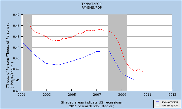
Krugman here and here presents versions of the following two charts, thinking he has refuted the “myth” that Texas has done better than other states during the economic downturn:

and

The first chart shows the unemployment rate of Texas against Massachusetts since Rick Perry took over. Krugman says, “Funny how Deval Patrick isn’t running for President on the strength of the Massachusetts economic miracle.”
No Dr. Krugman, what would be funny is if Deval Patrick did say that–at least vis-a-vis Texas–because that would be a stupid thing to say. What would the chart have to look like to show that Texas did do better than Massachusetts since Perry took over? In the beginning, when Perry first showed up, Texas unemployment was more than a full percentage point higher than it was in Massachusetts. During the boom, Texas unemployment dropped faster than in Massachusetts, and then during the bust, it rose more slowly. The net result was that by 2010, Massachusetts unemployment was about .75 percentage points higher than in Texas (just eyeballing the chart). So that’s almost a 2-percentage point swing since Perry took over. You’re telling me if unemployment dropped two percentage points after a new stimulus package kicked in, Krugman would scoff at the bogus “miracle” of deficit spending?
(Note, the trend flipped again after 2010, where Texas lost some of its relative gains back to Massachusetts. But it’s not close to being back where it started.)
It’s the same story with the second graph. This one is less comprehensible from the FRED-generated legend, but it shows (Krugman’s words) “the ratio of nonfarm employment to total population. The red line is the nation as a whole, the blue line Texas.”
So why is this chart allegedly so damning to claims that Perry’s Texas has outperformed the nation? Krugman tells us: “[T]his graph should put paid to the notion that Texas somehow escaped the recession, or that there was something miraculous about its job creation. Once you take account of population growth, nothing special happened.”
Really? I look at that same chart and see that the gap in % of employed people has been cut in half under Perry. If anything, that accomplishment is especially impressive, once we learn that Texan population grows higher on average than in the rest of the country.
So what the heck is going on here? It’s simple: Krugman is setting up an absurd strawman. Now maybe fools calling into Sean Hannity said, “Rick Perry is our guy! The Lone Star State has escaped the recession unscathed!”
But in terms of an actual economist trying to evaluate whether a certain state has had better policies fostering job creation than other states, for what evidence would we look? Since there are no formal immigration barriers to speak of, you would expect workers to flee states with government constraints on job creation, and flock to states with the ability to create jobs more quickly. This would take pressure off the bad states (thus reducing their official unemployment number at any time) and put pressure on the good state (thus bumping up its number).
Therefore, you wouldn’t see the good states with constant unemployment throughout an awful recession. Rather, you would see the state get hit less severely, compared to the other states. Or, if you were trying to evaluate a change in policies, you would check to see if the state in question improved on its comparisons during the period in question.
In short, you would see charts just like the above.
Now don’t get me wrong: I am not saying the above charts prove that Bush III should get credit for his free-market wizardy. I have no idea what policies he implemented, and I don’t know whether the above charts show that Texan policies are more conducive to job growth. There are other hypotheses, and Matt Yglesias (HT MR) at least attempts to sort out the various explanations.
My point in this post is that Krugman is being completely absurd (at least in these two posts). He is pointing at data that is prima facie going against him, and acting like it demonstrates his view. At best, he should say, “This isn’t a strong enough result to rule out noise,” or the like. Yet he seems to think that a truly good state wouldn’t see rising unemployment during an awful worldwide recession.
Incidentally, Krugman should understand the mechanism, since he talked about displaced workers moving into different states when discussing optimal currency areas. Yet another Krugman Kontradiction. When worker mobility across states is useful for making the argument to print more fiat money, Krugman is all about it. When it apparently will justify “conservative” economic policies, Krugman forgets all about it.


Would you say job growth figures are showing the same thing as unemployment growth figures?
Would you say employment figures are showing the same thing as employment to population ratio figures?
If your answer is “no” to those, then I don’t see what the problem here is. Krugman’s responding to specific job growth claims and those need some context. I’ve never heard him claim there’s no way Texas is better than average. It might be better than average for all I know.
I had to deal with this before the recent Texas “economic miracle” fight broke out in a research brief I was writing (not out yet). I’m looking at LED metro data, which is jobs data, across metro areas. All the Texas metro areas are doing great on job growth. So of course I report that, but I also made sure to look up other stuff too – and interestingly enough in July Texas was the exact middle of the 50 states and DC on unemployment. Twenty five above, twenty five below, despite the fact that it did by far the best on job growth. Honest analysts need to report all the data if the jobs data and the unemployment data tell different stories.
It’s just like every month when the unemployment figures come out. Do you ever hear anybody reporting just the unemployment rate? No. You hear the EP ratio and you hear the discouraged worker figure too.
As long as you’re not hiding data to make an argument, I don’t see what the problem is.
And Bob – I also know you know you’re not reproducing Krugman’s argument in its entirety. Selectively omitting points doesn’t mean you’ve managed a Krugman Kontradiction, Bob.
What are the other two things he’s been mentioning? No major housing bust and the oil boom. He’s admitted there are reasons why Texas is doing well, he’s just reasonably making the case that:
1. Job growth data needs to be looked at in the context of other data, and
2. There are two other very obvious places to look to explain Texas performance on other data, even after we control for labor force growth.
Do you disagree with either of those? I hope you don’t. What’s the problem then? Why are you so intent on this guy?
Daniel, that’s why I said “(at least in these two posts)” or whatever my wording was. I know Krugman has said a lot on it.
My point is, on these two posts, Krugman’s “evidence” goes against what he is saying. It would be like me pointing at 1941-1945 and saying, “See? Austerity measures help the economy.” Now if I had made a blog post saying that–and then elsewhere made points about Ireland and Canada after they cut spending–it would still make my WW2 post dumb, right? So that’s what I’m claiming with Krugman. He isn’t saying in these posts, “Coupled with my other points about oil and real estate, we see a pattern begin to emerge.” No, he’s saying, “Look at that chart! Ha! Texas and Massachusetts are the same! What frickin morons these conservatives are.”
Krugman’s series, scales, units, intervals, etc. are all carefully cherrypicked to tell the story that he wants to tell. I reproduced the graphs above, then changed the units, and now the graphs tell the opposite story.
http://research.stlouisfed.org/fredgraph.png?g=1DO
http://research.stlouisfed.org/fredgraph.png?g=1DP
Also, Will Grigg posted a must-read expose on Rick Perry today.
http://freedominourtime.blogspot.com/2011/08/ricky-rent-boy.html
What’s the logic of using an unemployment rate index?
Indexes, absolute values, percent change….they’re all different knobs that Krugman turns until he gets the picture to look the way that he wants.
Well he didn’t use the index you did. I don’t understand why one would index an unemployment rate. Could you explain?
No, please don’t misunderstand, I am not saying that it should or should not be indexed. I am saying that I can make the lines on the graph look the way I want depending on the parameters I choose. Krugman himself has said in the past that not considering the unique booms/busts in each state is sloppy. Yet this appears to be what he did.
But it doesn’t look the way you want if it doesn’t make sense!!!!
re: “Yet this appears to be what he did.”
Didn’t he talk about the uniqueness of the booms and the busts in Texas – what’s going on in the oil industry and the housing market there??? How can you say he’s not considering this???
Typically these AREN’T things you pick and choose. You almost always see economists using indexes for things like price levels. You almost always see them using rates for unemployment or employment-to population. You almost always see consideration of the behavior of both nominal and real interest rates and both nominal and real GDP. These are not just things that people pick and choose, there’s good reason for them to present the data in certain ways.
Which brings me back to my question: I’ve never seen anyone present an unemployment rate as an index number before. I thought you might have had a reason to. I’m getting the impression you don’t.
In the area where my parents live, south of Fort Worth, there has been a big boom in the past 5 years due to natural gas industry. And the booms have been both figurative and literal– several deadly explosions at gas wells.
It doesn’t really matter. In the world of politics his criticism is too nuanced to affect the electorate. All Perry has to mention as a rejoinder to the New York comparisons is the trillion dollar Wall Street bailout. “Sure, if Dallas received a trillion dollars to bailout our companies we wouldn’t have anybody unemployed either!” Massachusetts isn’t big enough for anyone to really think it’s something other than a fluke.